An exclusive wine distributor from Ukraine.

Create a visual identity that reflects the core metaphor of the brand — a single "root" connecting various authentic European wines. The goal was to convey expertise, origin, and quality through the design. We also needed to develop printed materials, uniforms, and a presentation template.
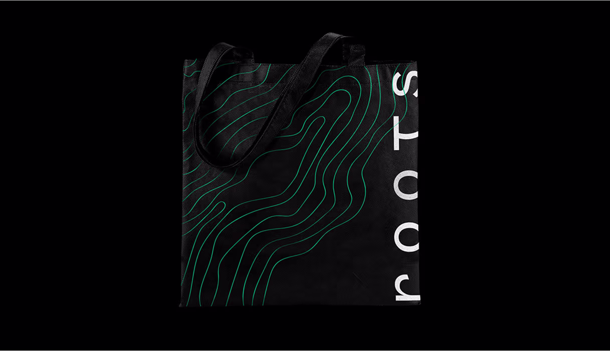
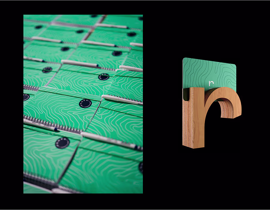
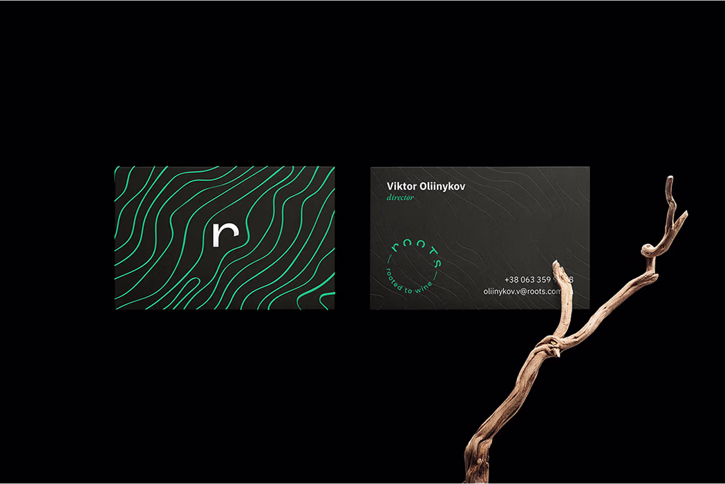
We built the brand around the root metaphor, integrating it into typography, graphics, and illustrations. The identity balances elegance and authenticity, reflecting the brand’s premium and curated nature. All deliverables - from print to uniform - share a consistent style, forming a cohesive and memorable brand image.
.avif)
.avif)
%20(1).avif)
%20(1).avif)
.avif)
.avif)
Because the company stands firmly on the ground: they are aware of the high-qualitywinemaking traditions & respect the classic grape varieties and wine regions. And at the sametime, boldly look forward to new, promising grape varieties, growing butambitious wine areas.
.avif)