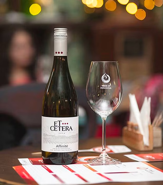
Wine of Moldova


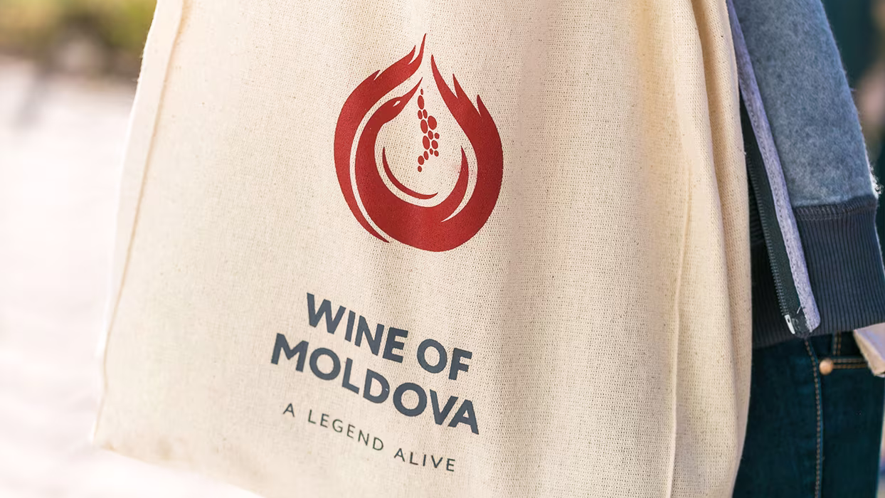
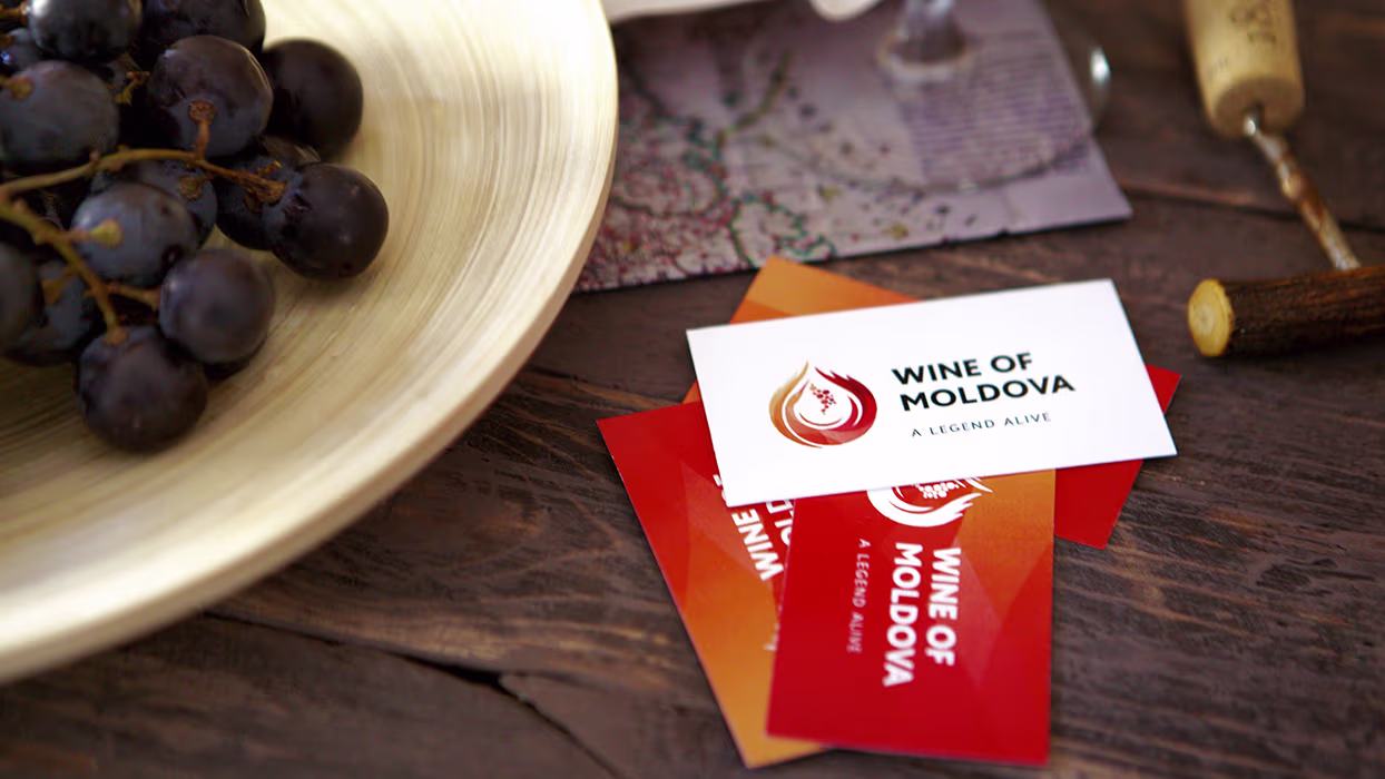
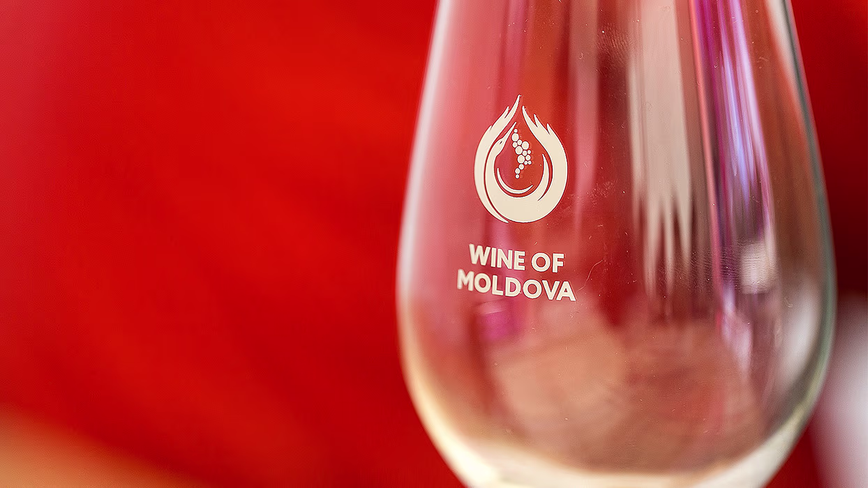
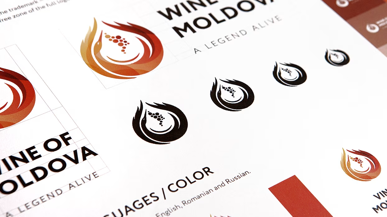
Our winning concept, "Wine of Moldova," featured a symbolic logo of a white stork carrying a grape cluster shaped like the map of Moldova, forming a drop of wine. The design integrated four natural elements: grapes (earth), stork (air), wings as flames (fire), and wine drop (water). This multidimensional approach communicated tradition, origin, and quality, successfully meeting the brief and winning the tender.
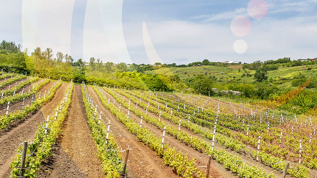
The project, initiated by the US Government and the Ministry of Agriculture of the Republic of Moldova, called for the creation of a new winemakers' association and a national wine brand. Participants were required to present a unique vision, including the name, slogan, and logo. The goal was to craft a compelling identity that reflects Moldova’s wine heritage and boosts global recognition.
Logo represents a stylized image of a white stork with a bunch of grapes. White stork in this concept is a traditional symbol and a sign of the quality of Moldovan wine growing and winemaking. Aside from the obvious symbol of a stork, there is a number of additional meanings higgen in the sign. For instance, the overall silhouette is designed in a shape of a drop of wine, wings make up the image of flames, and the bunch of grapes follows the contours of Moldova on the world map ultimately. Thus, the brand name is a combination of four elements. The grapes represent a symbol of the earth, stork is a symbol of the air, wings became the fire, and a drop of wine symbolizes water.
.avif)
.avif)
.avif)